First up is an art doll swap. The theme was fall/winter/christmas.
I just could NOT figure out what I wanted to do for this. Correction. I thought I wanted to do one thing (a mushroom person thing) but it just didn't do it for me. I was bored with the idea from the start. Then all the sudden I wanted to make Krampus. But that didn't seem like something my recipient would be into (even though it's not a profile specific swap).
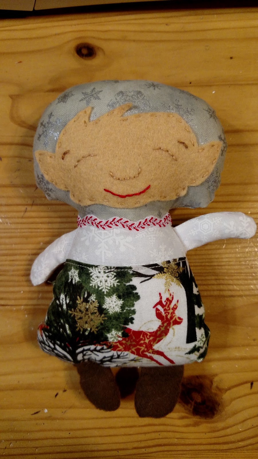
My partner liked bright fun colors and "whimsy". So I went out on a limb and decided to try out a new Dolls and Daydreams pattern I grabbed up during the last sale. It's the 7 dwarfs/elf pattern that has a TON of options for customization.
I dug up some of my brightest/most fun christmas/winter prints so it would be lively and bright (my partner's profile specifically noted they don't like drab fabrics).
But it still felt less art doll-ish than I normally make. For me, "art dolls" need to be less kid safe then a regular stuffed toy which means I need to put a bit more work into adding extras to them (or they need to just straight up NOT be a toy, like the painted doll I did for halloween. . .that's so not a toy for kids to maul).

So I had some fun with his hat.
Elroy Elf is headed off to his company party and hopes to win the Ugly Hat contest. (what? ugly sweaters are SO over, like five years ago!). He even has his white elephant gift which he hopes goes over well (jokes on everyone, it's just a piece of styrofoam wrapped in fancy paper!)

That hat is tacky on BOTH sides.
Good luck, Elroy!
I hope this is well received since it's not as hard core "only adults may touch this because it's just so NOT for kids" art doll but it's still very "artsy". It's well made and meets the size requirements so there's really no way I won't get a full rating but I just don't want to disappoint my swap partner (though if someone made this for me I'd be thrilled, it's cute as shit as far as I'm concerned).
Next up are the latest set of patches for the Disney alphabet swap.

M, N, and O
Closeup time!

M is for Mickey Mouse. I knew I wouldn't get through this swap without making the classic Disney mouse ears design (and I welcomed it since it would be an easy yet good looking patch). I stuck with Mickey's color scheme, too. Red, yellow, and white. (no back shot for this since it's just solid yellow). This was a super easy patch but it still looks good (simple doesn't have to mean you're cheating your swap partner, sometimes simple works).

N is for Nightmare Before Christmas.
Holy crap, looking at this pic this patch turned out really great (that's not to say it's hideous in person, just that it's photogenic considering it wasn't that hard to make). I went with a simplified version of the graveyard scene (which I think is also the cover art for the movie, except it has Jack on the little curly thing).
Detail shot!

Oh, yes I did. I cut that little curly cue right out of felt and it wasn't that hard at all. The curly and the moon are felt glued to cotton fabric. The grave stones are felt, glued and stitched down (the one against the purple is just glued, the other one needed a few stitches since the glue didn't really stick to the felted sweater used for the foreground).
I got super lucky when I was going through my felt scraps to find bits for the tombstones I found some bits from a felted wool sweater. It was a striped sweater and the one color was perfect for a dark earth look BUT it also had just a tiny bit of the yellow from the stripe next to it so it looks like moonlight shining on the ground. I love when happy accidents happen like that.
Then I added my last jack-o-lantern button (I want to get another card of those, they're cute but not too cute). The true art is more detailed with a bunch of stones and a pathway and all kinds of pumpkins. I simplified it a lot.
I have to pause to mention how great that purple background fabric is. I was going for either a dark blue or purple and when I spied that purple it beat out the few blues I had pulled as contenders.

That's the background. Crazy dancing skeletons. I was tempted to use the same purple fabric for the backing/frame and I was tempted to use solid black but once I saw this fabric I had to use it. Its' a nod to Jack.
(I also sent along a package of these super cool Nightmare Before Christmas buttons. They have full figures of Jack and Sally, two Jack faces, AND a full figure button of ZERO! I have a pack for myself but I was feeling greedy and didn't want to use any of mine so my swap partner got her own pack. . .she's a great swapper so she deserves a great bonus).

O is for Oogie Boogie, looking all sinister.
I hadn't planned to do two Nightmare Before Christmas patches in this set but it just worked out that way.
Oogie is made from a thicker type cotton (it's kind of like a khaki pant thickness) fused to a regular quilting cotton background fabric (it's a bright green, the pic washes it out a ton). His face is heat set fabric marker (I made a stencil from the image I had and it worked like a charm).
This was a simple patch, too, but looks really cool. It's a bit big but I think it needs to be big to really get a good look at Oogie's face.

The backing. Yes, I fussy cut a bit to make sure the "something wicked" fully showed on the back (wasn't a big deal since it was at the edge).
Once again, my fabric stash comes through for me. I thought I might have to get a piece of burlap-esque fabric for Oogie Boogie but that heavier weight cotton has just enough texture to it to pull off the look.
Next up are patches for P, Q, R, and S. I have a few ideas already but I haven't given it a good think yet, so nothing is set in stone.
I realize I'm partial to Nightmare Before Christmas, anyway, but the "N" and "O" patches look great. You totally nailed Oogie!
ReplyDelete